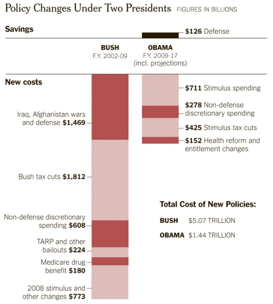
 Via NYT:
The first graph shows the difference between budget projections and budget reality. In 2001, President George W. Bush inherited a surplus, with projections by the Congressional Budget Office for ever-increasing surpluses, assuming continuation of the good economy and President Bill Clinton’s policies. But every year starting in 2002, the budget fell into deficit. In January 2009, just before President Obama took office, the budget office projected a $1.2 trillion deficit for 2009 and deficits in subsequent years, based on continuing Mr. Bush’s policies and the effects of recession. Mr. Obama’s policies in 2009 and 2010, including the stimulus package, added to the deficits in those years but are largely temporary.
Thanks Nathan!