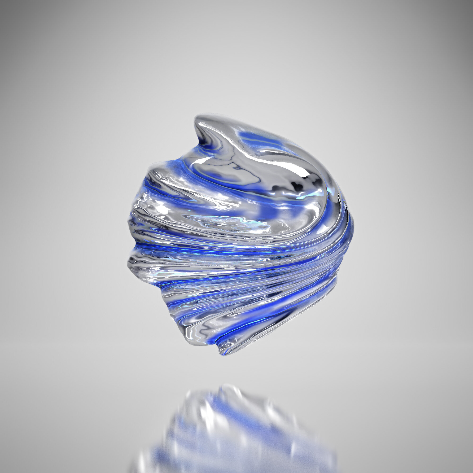
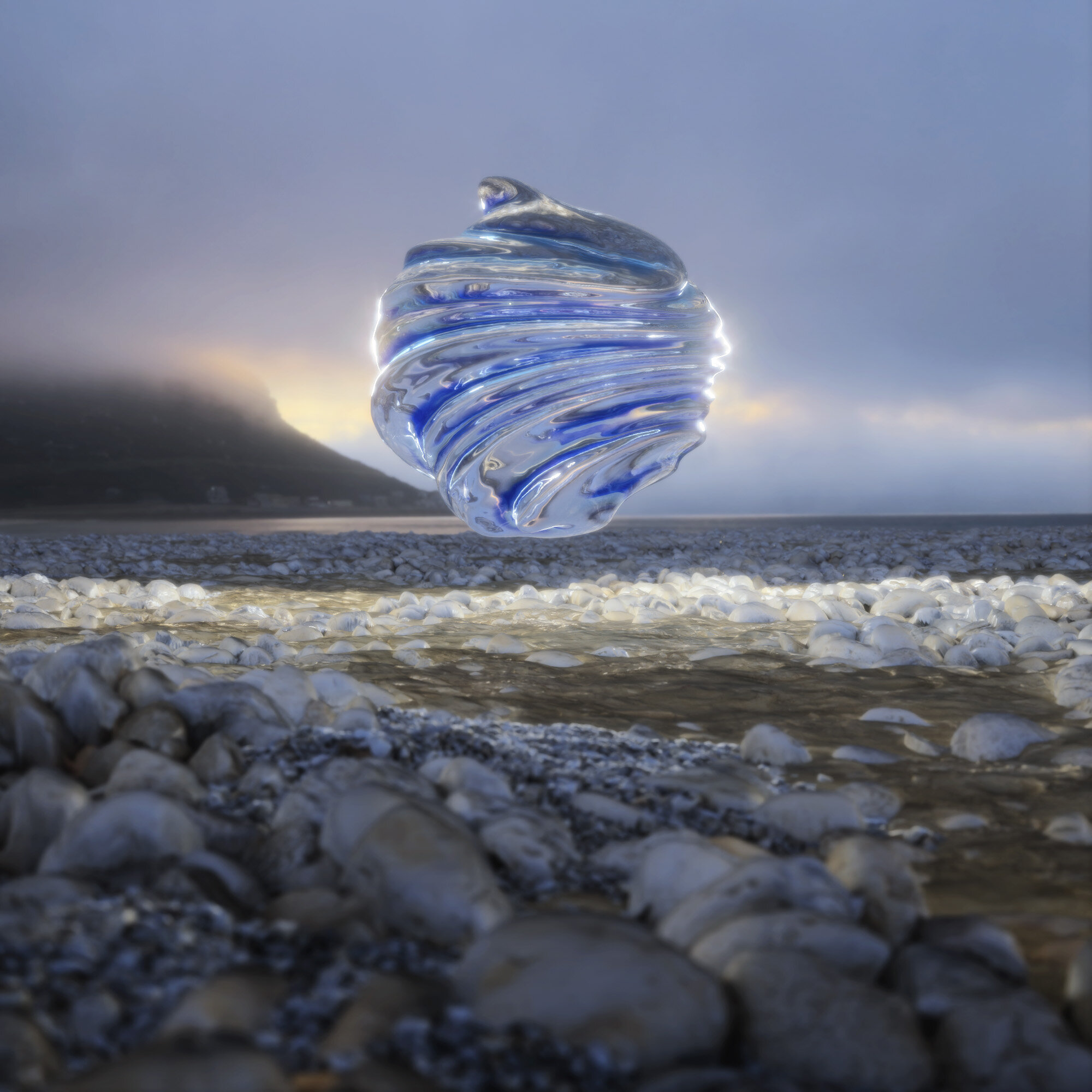
Was tinkering around with the concepts from this Entagma tutorial and came up with this variation on it. Pretty straight ahead, but kinda fun.
New work in the Wild
I did some album artwork for local Portland band “Hawks Do Not Share” that will be on vinyl and CD. The imagery is also featured on the website, will be a shirt and did a looping animation for a lyric video. Pretty fun project. When I get the product here I’ll probably update the portfolio with it all proper.
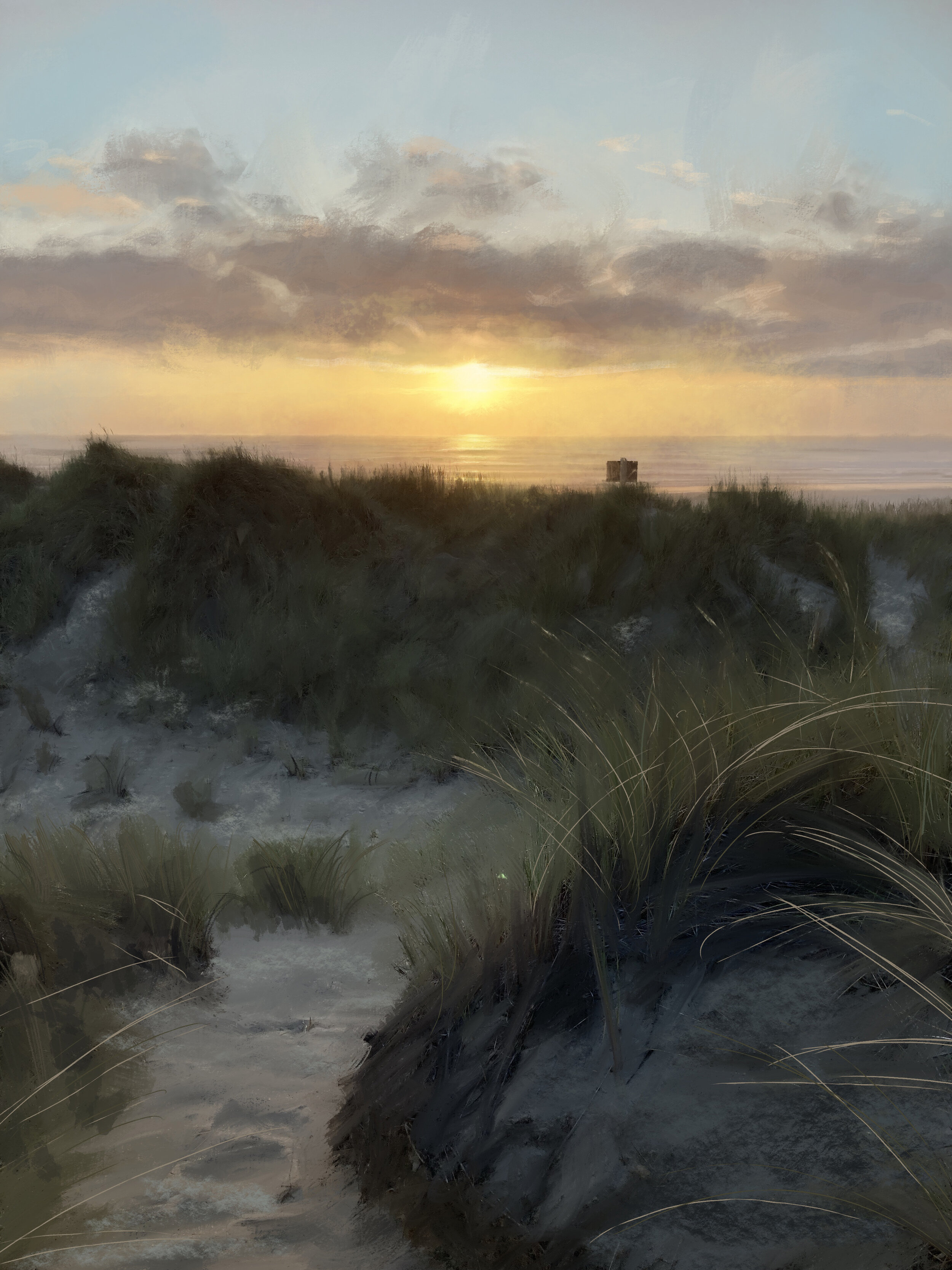
Some Digi Painting from the Oregon Coast.
Was messing around with Procreate on the iPad while at the coast and started to get some interesting results.
Doodles!
Some bends, vdbs and other such things in Houdini.
Basketball still life
Here is the finished render from the sim below that was glitching out. Houdini vellum and Redshift render.
Vellum Doodle
Just messing around with some vellum cloth sims today. Going for that cloth landscape kinda look.
4-28-21 doodle
Just kinda wanted to riff on those tables that have resin cut out in them here. Tri-planer shader in Redshft came in handy while texturing the wood.
Yesterday's doodles.
So I have been taking a bit of a creative hiatus / break for a bit to help with the COVID burnout and I opened Houdini for the first time since (checks blog posts) yikes, January. Was just messing around with some displacement and then the map box node to import the topo data on Mt Hood. These are the results of the stuff. I actually enjoyed the process and exploration of it again. Which was the goal of taking a break in the first place. Now I just need to update the portfolio….
Album Art Feature.
Got a little write up for some of my Album Artwork I did.
“Inertia by We Are Parasols is coming in hot with this rainbow orb! The art was created by Daniel Kopton . This feels like something I could see in a museum. It would make a great desktop background, too. A poster, even. Basically what I’m trying to say is that I love looking at this. The choice of using a bar code instead of text is bold, but I think it works well.”
Still Life Study
Way back in September, I talked about doing a lighting study on some of Niall McDiarmid images. Well I finally got around to one of them! Took me long enough….
Built it out in Houdini with a quick Vellum sim for the napkin and towel thingy. The new vellum brush tool is quite handy to use. Lots of fun as well. I did learn how bad Redshifts Sub Surface Scatter is though trying to get the ketchup, mustard bottles and bread to look like anything other then plaster. It took a mix of roughness settings and coating to get it looking close to how I wanted. Using both the Sub-Surface and SS Multiple Scattering was not getting it there. Adding detail like the lipstick and coffee stains was super easy though.
Made a simple markup of the lights as well. Nothing too fancy. The super narrow spotlight for caustics is the only little trick in there. The light in back of the bottles was originally just there to help me work on the SSS, but I liked how it made that highlight on the table. Kinda looks like a window or something.
More Album Artwork
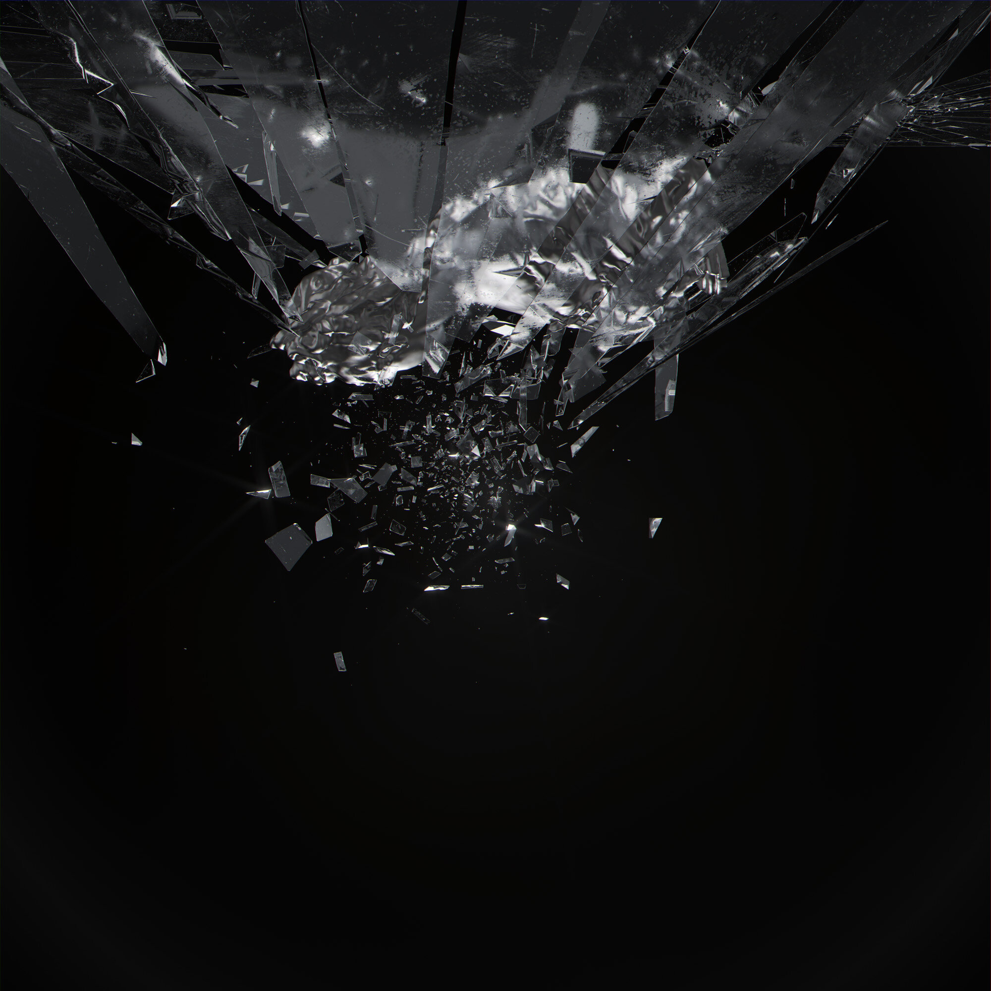
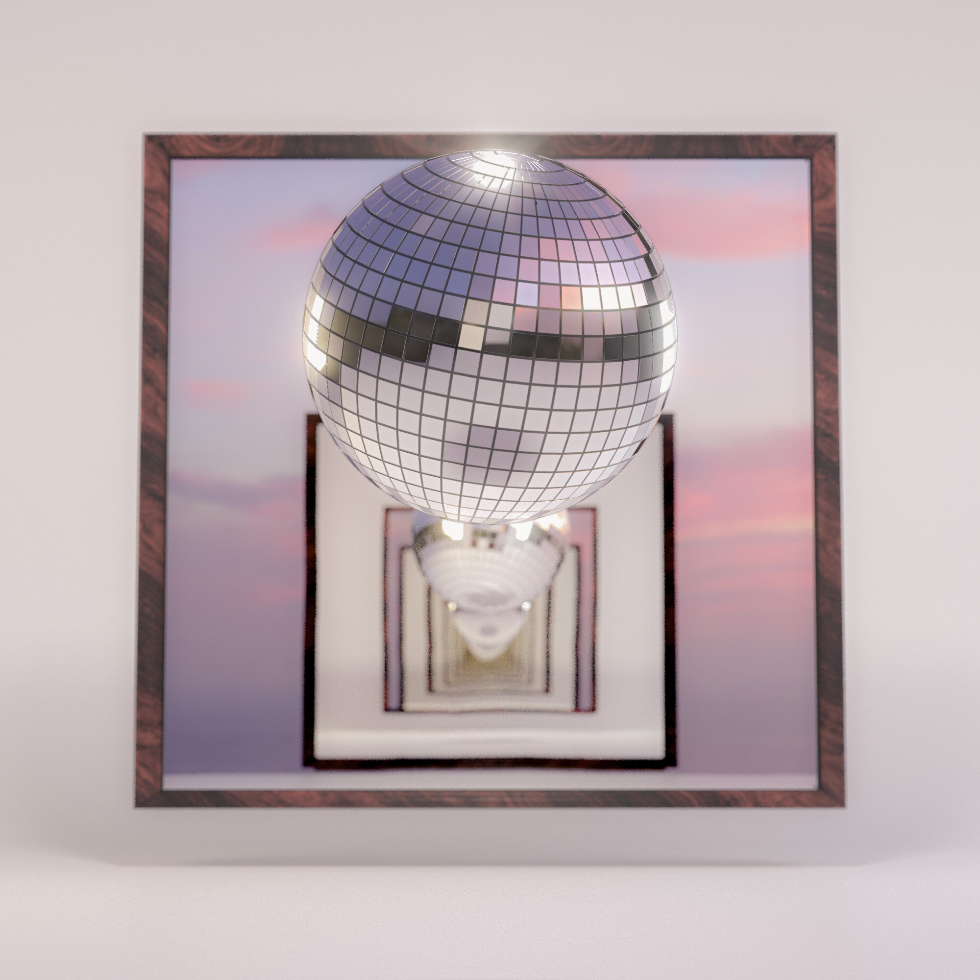
The band that I did the Shatter Bust artwork for liked that one so much they asked for something for a Single. So I blew up a disco ball, as one does.
Houdini Abstract Study
Messing around with the “Connect Adjacent Pieces” SOP in Houdini.
Houdini Doodles
Just playing around with simple clean sets here a bit. Want to work on bashing out a few sets a day to see what I can come up with.
2020 Fall Portland Color Palette
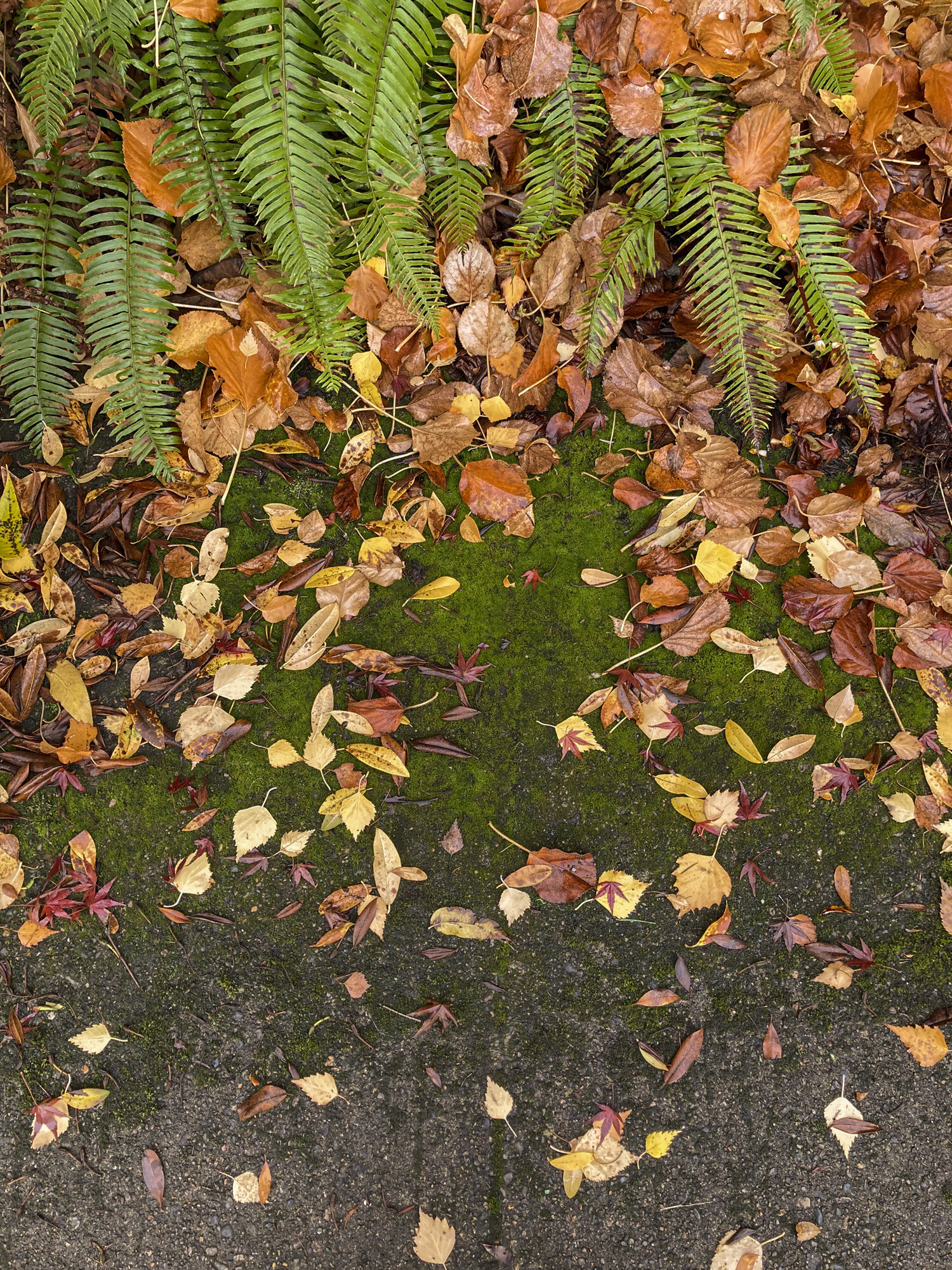
Just walking around with the phone collecting some images that I will use for some Fall color palettes this season. Some interesting tones to pick from.
Well, hello there...
Been a hot minute with no updates here, sorry about that, but between all the election crap and a boat load of work landing I have not had much brain power at the end of the day. Anyhoo, here is a bulk dump of some more mirror balls and other studies I was working on. Just tinkering with some ideas here.
Jar Studies
Here are the three jar images all finished up and in one post to check out.
This Machine Kills Fascists
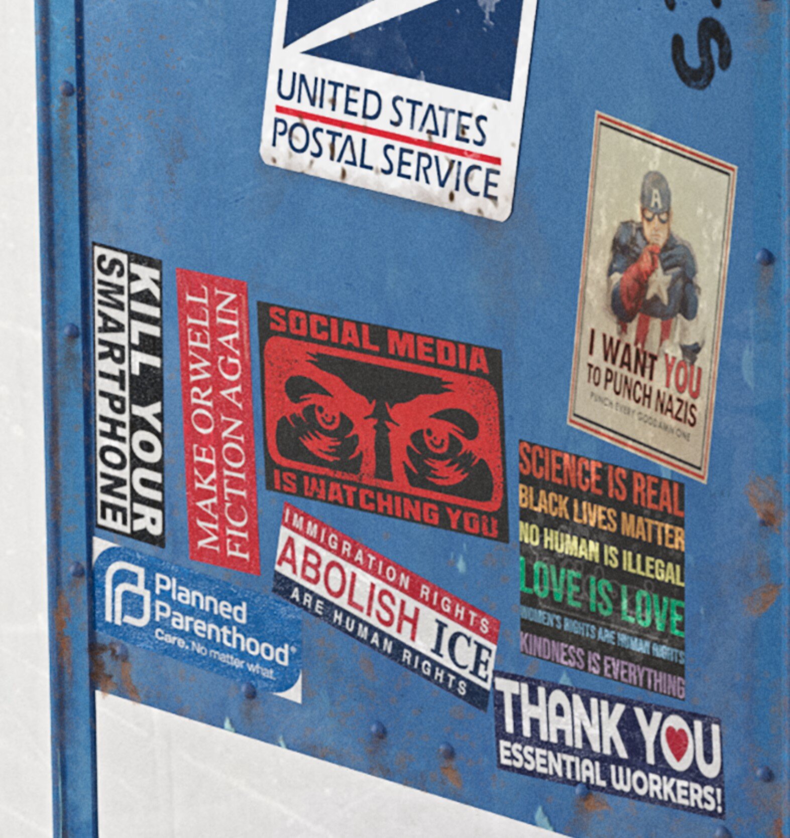
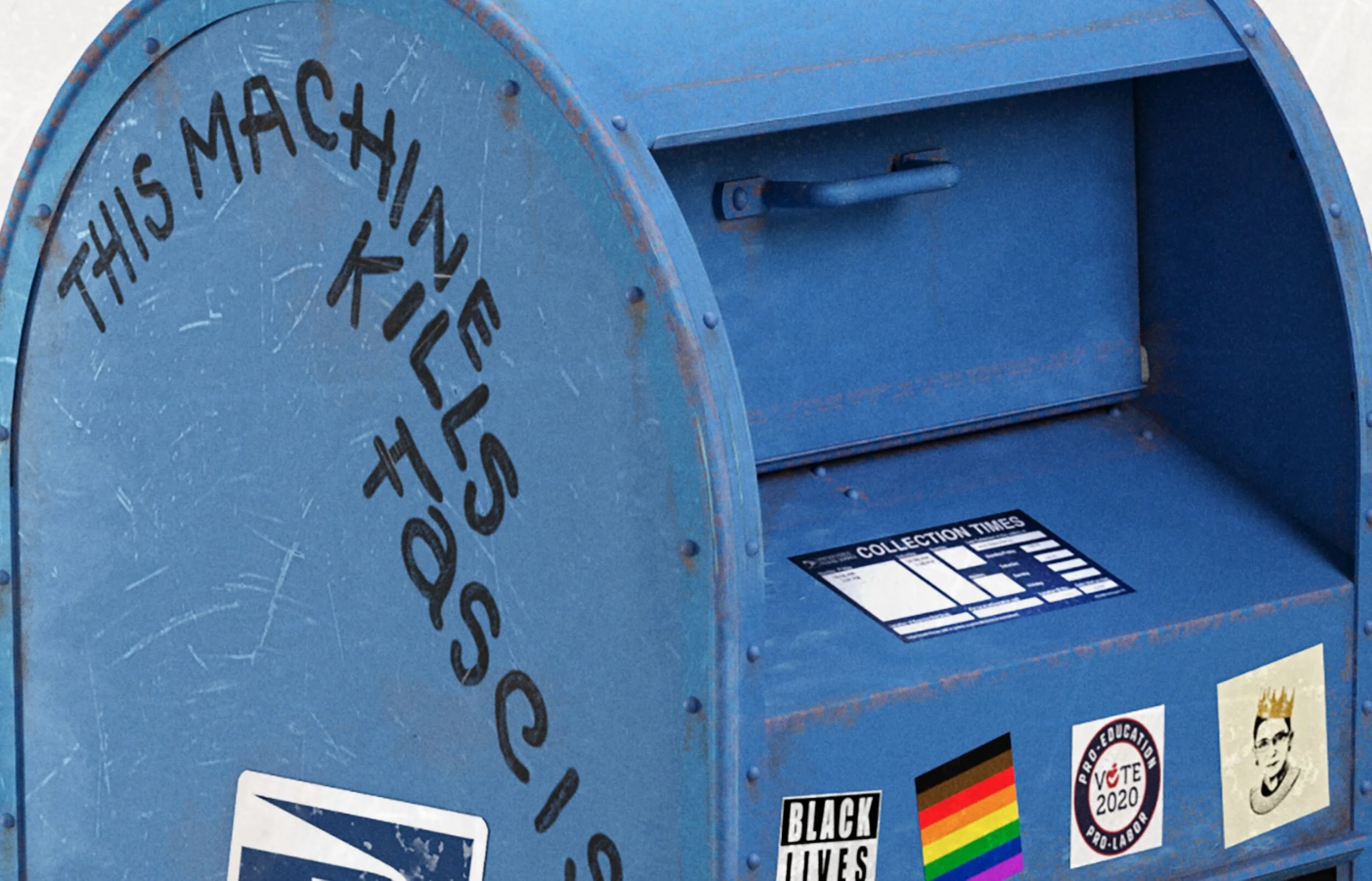
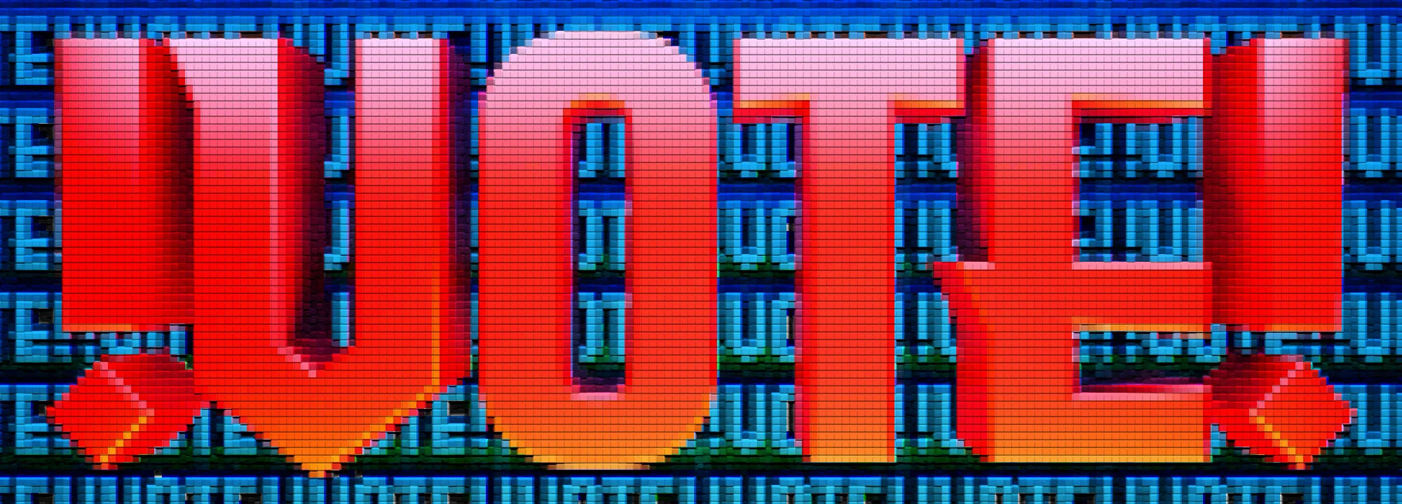
Inspired by the Great Woody Guthrie, I made a new piece of artwork this weekend in response to the Alt-Riot / Proudboys coming into our town from out of state to cause havoc. Get out and Vote people. It’s pretty bleak out there, so do what you can.
Moon Hooch
I keep trying to come up with a better name for this one, but “Moon Hooch” seems to be the one that sticks for some reason, lol! More of the “jar” series I am messing with.
Principles for better design
Crazy, windy, smokey weather here and not enough time to continue with the Jar project. I did start to play with adding more jars and getting the boolean dirt to work with them before I got busy again though. Found this good article on Design though.
“The moka coffee maker may not produce perfect coffee, but it requires so little maintenance compared to a large coffee machine with radiators, pipes, grinder, etc. that it makes the compromise “complexity / coffee taste” great.
Remember the Pareto principle: in general 80% of a things can be done in 20% of the total allocated time. Conversely, the hardest 20% left takes 80% of the time. Perfection requires infinite time and energy. This is impossible and therefore should not be part of your design.”
And here is where I left off with the jars. Need to tweak the UV’s on the far left and do all sorts of other stuff, but it’s coming along.
Not a Drop to Think.
Water, water everywhere….
Newest little jar study I worked on over the weekend. Pretty happy with the sand texture I was able to come up with. The water itself works but is a hacky bit of shading held together with duct tape and chewing gum. I did one version where I punched in with a 110mm lens instead of a 90mm like in the first and added some volumetrics to the lights, but It kinda broke it out from the series too much. So now the whole series will have the same lens and light settings. I don’t even think I’ll rotate the jar. Just change up floor textures along with what’s in the jar. Might drop some cloth in the background for some texture and see if that works though. The light rig is basically a room with a slight gap to the “front” and two windows on the side. It’s giving it that nice classic still life look. As always, click the thumbnails to see bigger images.
Pretty happy with this series so far. Next one will be fire.
Been enjoying staying off of social media and my very limited news diet. Highly recommend a news detox to anyone. Also, facebook is mostly made of evil. Check the links on the right for non, “Walled Garden” content. 3 Quarks always has some good long reads to check out.


